

El tablero como laboratorio de producto
In September 2026 the project was still called Blupoli Puzzles. Today that product lives inside Blupoli as Blupoli Puzzles, but one of the most useful design decisions from that period still explains a lot of the interface: before trying to redesign the whole catalogue, we used Sudoku as a laboratory. The reason was not that every future game should resemble Sudoku. It was that we needed one sufficiently familiar mechanic to separate problems caused by the puzzle from problems caused by our own interface.
That choice removes an important source of ambiguity. If you test an interface on an unfamiliar puzzle, confusion can come from two directions: the mechanic may be new, or the product may be failing to explain itself. Sudoku narrows the question. Many players already understand the broad goal, the 9×9 grid and the role of rows, columns and boxes. If selection feels unclear, controls are hard to reach or the board loses visual priority, the mechanic has fewer places to hide the weakness.
It also protected us from another common mistake in products with many surfaces: trying to invent the perfect system from a bird’s-eye view. A large catalogue encourages abstract component thinking, but useful systems usually emerge from concrete states. Taking one game all the way through real interaction, feedback, mobile pressure and edge cases produced evidence that a set of wireframes could not.
A laboratory needs a question, not just a polished prototype
The question was never “How do we make a beautiful Sudoku?” It was “What can the platform learn here so that the next game starts from a higher baseline?” Every improvement therefore had to be considered twice. First: does this make Sudoku genuinely better? Second: which part belongs to Sudoku and which part solves a recurring product problem?
A numeric keypad is clearly mechanic-specific. Keeping high-frequency actions close to the board may be general. Candidate notes belong to Sudoku. The way selection, focus and invalid actions are communicated may travel. Row, column and box highlighting is part of Sudoku’s reading model. The hierarchy between board, configuration and help can survive much farther.
That filter kept us from confusing “excellent in this one game” with “should become a standard.” A laboratory produces hypotheses before it produces rules. Those hypotheses still have to survive contact with different mechanics, and we need to be willing to discard them when they do not.
The first improvement was giving the board its job back
On a puzzle page, the board is the task. Everything else exists to support that task: explain it, configure it, recover it, restart it, help with it or record its outcome. Interfaces that grow by accumulation often forget that hierarchy. Headers, buttons, selectors, explanatory blocks and cards compete for room until the interactive object becomes one more panel in the page.
Sudoku made that failure physically obvious. The grid needs enough size for cells to remain distinct, candidates to stay legible and touch input to be reliable. Desktop offers room for surrounding controls; a phone makes every line above the board expensive. This pushed us to rethink page width, density and control order rather than merely reskinning the old layout.
The goal was not “make the board huge.” It was “make priority visible.” Editorial content can sit farther down. Rare settings can be grouped. Solving actions should stay near the work. That hierarchy later became part of the shared UI system for Blupoli Puzzles.
Frequency of use started to determine physical proximity
Sudoku repeats the same actions constantly: select a cell, enter a value, switch into notes, erase, undo, perhaps inspect a conflict. Difficulty and board configuration matter, but they are not usually touched every few seconds. Presenting both groups at the same visual level makes the screen noisier and forces more searching than necessary.
The laboratory helped us separate configuration from solving tools. The former can remain available without demanding constant attention. The latter should be reachable without mentally leaving the board. On mobile this difference becomes especially important: a poorly placed frequent action turns into hundreds of unnecessary thumb movements.
The resulting rule is not “every game uses the same button row.” It is “place actions according to their relationship with the reasoning loop and how often they are needed.” Nonogram can have different tools, path puzzles can avoid a keypad entirely, and a CPU game can organize actions around turns while still following the same product logic.
Visual states had to explain rather than decorate
Sudoku offers an unusually useful set of states for testing visual language: selected cell, related cells, matching numbers, candidates, givens, player entries, conflicts and completion. They all compete for limited channels—color, border, background, weight, iconography and motion. If every state shouts, the grid becomes harder to read.
The laboratory taught us to ask which information should persist and which should appear only when relevant. Selection needs to be unmistakable. Related cells can be softer. Errors must remain recognizable without relying solely on red. Givens need to differ from editable values. Candidates must remain legible without turning every cell into visual noise.
This work mattered more than choosing one final palette. Palettes can change. The semantics of states should not. Separating those two layers later made light and dark themes much more manageable because the meaning of an interaction no longer depended on one fixed set of colors.
Candidate mode exposed the difference between game state and interaction state
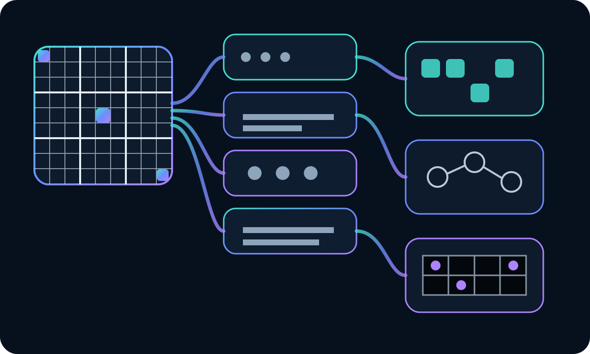
Candidate notes are distinctively Sudoku-like, which makes them a good way to see a more general pattern. Switching between entering a final value and recording possibilities does not change the rules of Sudoku. It changes the user’s interaction intent. The UI needs to communicate that mode clearly enough to prevent silent mistakes.
This state sits in a boundary area. The engine understands candidates, but the shell may own the control that activates the mode. Both sides need a small, understandable contract. That observation helped us think in extension points rather than accumulate Sudoku-specific conditions in the common layer.
Other games have different equivalents: fill versus cross, draw versus erase, assert versus eliminate. The functions are not identical, but they share the pattern of “interaction mode.” The laboratory gave us a concrete case from which to recognize that pattern elsewhere.
Keyboard support should not feel like a lesser version of mouse input
Sudoku is naturally friendly to keyboard navigation. Arrow keys can move selection, numbers can enter values, and additional keys can trigger common actions. But an accessible experience does not appear automatically once key events exist. Focus, order, feedback and parity with touch and pointer interactions still need deliberate design.
Working through those details in a familiar game exposed inconsistencies quickly. What happens if visual selection and DOM focus diverge? Can a given cell receive focus even though it cannot be edited? How is a conflict announced? Does undo return the experience to a sensible interaction point? These are product questions, not optional compatibility polish.
Once the answers become patterns, other games inherit a stronger baseline. They may use different keys, but the system can still guarantee visible focus, meaningful states, reachable actions and predictable semantics. Sudoku made accessibility part of early design rather than something added after the visual work was “finished.”
Mobile proved that responsive design means reordering, not shrinking
A 9×9 grid has a useful property for testing: its proportions are familiar. That made it obvious when the real problem was not the board but everything around it. On a narrow screen, preserving the desktop layout and scaling it down creates tiny text, dense controls and frustrating touch targets.
The better response is to let the hierarchy change. Configuration can collapse. Actions can move. Explanatory content can fall well below the play area. Margins can compress differently from touch targets. The board can occupy nearly the full width without the page losing structure.
This became important later when we evaluated Android packaging through Capacitor. A wrapper only makes sense if the underlying web experience is already touch-friendly. We explain that strategy in the article about taking the web product to Android. Sudoku was one of the places where the web foundation first had to prove itself.
Onboarding should answer the first action before reciting the rulebook
Sudoku also gave us a safe place to challenge how we taught games. It is easy to write a complete rules section and assume the onboarding problem is solved. But a person opening a game usually needs a different sequence: what can I touch, what changes when I do, what does this state mean, and where can I get more help if I need it?
Because the mechanic was familiar, we could test a more interaction-oriented introduction: identify the goal, show selection, enter a value, explain notes, then offer a path to fuller rules. It became easier to see whether the tutorial was helping or merely interrupting.
Later, this work expanded into interaction profiles for different puzzle families. The central lesson remained the same: share the tutorial container and navigation, but adapt the scene and explanation to the mechanic. The product should be learned once; each puzzle should teach only what is genuinely new.
Victory needs to close the session without breaking concentration
Detecting a solved Sudoku is easy compared with deciding what the product should do next. An aggressive celebration can feel out of place. A subtle signal can leave the player unsure. Completion also has to coordinate statistics, persistence, the ability to inspect the finished board and the path to starting another game.
The laboratory forced us to treat victory as a product state rather than a boolean emitted by the engine. The engine can say “solved.” The shell decides how the experience changes. That pattern applies widely and prevents every game from inventing its own modal, tone and exit flow.
Completion also reveals the need for good data boundaries. Recording a solve may require variant, difficulty or board size. The UI should not invent those facts. Engines and metadata should expose them. A seemingly simple visual state therefore connects interface design, persistence and domain modeling.
A familiar case reduced the risk of premature abstraction
One underrated benefit of starting with Sudoku was that we did not need to prove the mechanic itself. We could spend attention on the platform. That let us test ideas deeply enough before turning them into shared contracts.
If we had tried to design the shell from a theoretical list of dozens of future games, we would probably have created an abstraction full of options “just in case.” The laboratory encouraged the opposite approach: solve one representative experience well, then deliberately test the pattern against very different cases.
When a piece failed outside Sudoku, we did not always try to rescue it. Sometimes the correct conclusion was that it belonged to the game rather than the system. That willingness to retreat keeps the shared layer simpler and leaves more room for genuine variety.
Category identity came later, and that order mattered
Once the core interaction structure became stable, we started experimenting with category colors and visual continuity between catalogue and game screen. Doing this later was important. If thematic identity had arrived before selection, contrast and state semantics were solved, it would have occupied channels the mechanic needed.
Sudoku suggested a conservative way to use category accents: the frame can carry identity while the board preserves its own information hierarchy. That rule becomes even more important in puzzles where color already encodes regions, relationships or pieces.
The result is identity that accompanies rather than invades. Brand and category help you recognize where you are; the logic of the game decides how the reasoning surface should be read.
The laboratory revealed debt that did not look like a bug
The more polished Sudoku became, the more obvious differences elsewhere appeared. A well-placed control made another game’s control feel far away. A clean hierarchy made an older layout look crowded. Correct focus treatment exposed missing states in other engines. That comparison was one reason we eventually paused expansion and performed a broader product audit.
The process is described in our article about auditing before adding more. The important point is that a good laboratory creates a reference, not only a solution. That reference can reveal product debt that never triggers an automated error but still creates real friction.
The risk, of course, is treating Sudoku as the judge of everything. We avoided that by using principles—clarity, proximity, hierarchy, feedback—rather than exact dimensions or controls. The audit asked whether another game solved the same need, not whether it looked the same.
From laboratory to shared interface system
After enough iterations, some ideas stopped being hypotheses and started recurring successfully: a game shell, coherent action states, layouts that reserve room for the board, help mechanisms, theme support, focus patterns and extension points for mechanic-specific tools. That collection became the system described in “How to design one shared UI for puzzles that look nothing alike”.
The relationship between the two stories matters. The laboratory explains where the rules came from. The system explains how those rules are maintained once many mechanics depend on them. Keeping those moments conceptually separate helps prevent a design-system mistake: building components before knowing which product behavior deserves to repeat.
What we refused to generalize mattered just as much
Sudoku contains patterns that should remain local: its regular grid, numeric keypad, candidates, row-column-box relationships and certain forms of highlighting. Making a path puzzle, connection game or competitive board adopt those patterns for the sake of consistency would be bad design.
The laboratory therefore taught us to document boundaries as well as reusable ideas. A healthy system says both “this is shared” and “this belongs to the engine.” That clarity reduces the temptation to keep adding generic options for cases that are better solved locally.
Paradoxically, protecting differences makes the platform feel more coherent. When the common frame leaves enough room for the mechanic, players can trust what is familiar without losing the reason they chose a different game.
The useful metric was how much work the second game could avoid
A beautifully polished Sudoku could still be an architectural dead end if every improvement had to be rebuilt elsewhere. We therefore started valuing decisions by their ability to propagate. Can a focus improvement help other games? Can a layout change happen through the shell? Does onboarding share infrastructure? Do error states use common semantics?
Speed here does not mean producing one screen faster. It means raising the quality floor inherited by the next game. That compounding effect is why interface-system work can be valuable even when it adds no new mechanic.
The same logic applies to fixes. If correcting an accessibility issue in the shared layer improves many experiences, the architecture is working for the product. If every correction requires opening dozens of files, there is probably still a boundary worth revisiting.
A good laboratory succeeds when it stops being special
At first Sudoku received exceptional attention because we needed to learn. The goal was never to keep it permanently privileged. The goal was to extract what mattered and let the rest of the catalogue benefit. When that happens, the laboratory has done its job: it stops being an exception and becomes the origin of common capability.
Blupoli Puzzles has changed significantly since the Blupoli Puzzles of September 2026. The name changed, the editorial architecture changed and the product gained more layers. But we still use the same sequence when a broad problem appears: choose a representative case, solve it deeply, observe the principles, test them elsewhere, then build infrastructure only after the evidence is strong enough.
That approach avoids two bad extremes. We do not redesign the whole catalogue at once, and we do not let every screen evolve in isolation. We learn in a small place so that the product can improve at scale. Sudoku happened to be an excellent laboratory because its familiar rules kept the spotlight on the thing we actually wanted to study: the platform around the grid.