
Compartir experiencia sin borrar personalidad
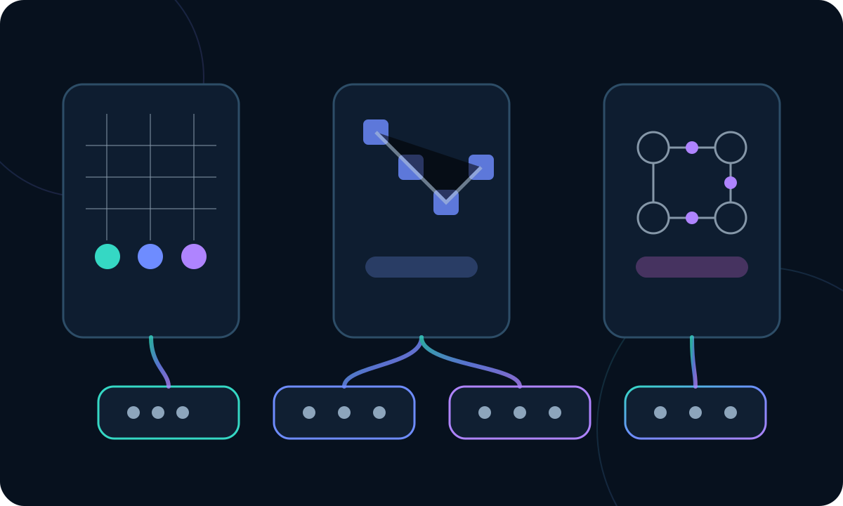
When the first version of this article was published, the project was still called Blupoli Puzzles. That platform is now Blupoli Puzzles, but the design problem has not changed: how can someone move from Sudoku to Nonogram, from a Logic Grid to a region puzzle or a game against the CPU without feeling as though they have opened five unrelated applications? The easy answer is to impose one visual template. The better answer is harder: decide which parts of the experience should be predictable and which parts need to remain native to the mechanic.
That distinction matters because consistency and uniformity are not synonyms. Consistency lowers orientation cost. Uniformity, pushed too far, erases useful information. Sudoku needs to communicate boxes, givens, candidates and cell relationships. Nonogram relies on edge clues and fill states. LITS depends on regions and shapes. Logic Grid is about relationships between entities. Ataxx needs turns, pieces and an opponent response. Giving all of them the same surface language because they are “games” would be like insisting that a piano, a guitar and a drum kit use the same control panel because they all make music.
The first question should not be “Which components can we reuse?”
As products grow, design-system conversations often jump straight to buttons, cards and component libraries. It is tempting to spot a repeated shape and immediately turn it into a reusable primitive. The problem is that two things can look the same while serving different jobs, and two jobs can be equivalent even when they need different representations. Before extracting a component, it is more useful to identify the user expectation we are trying to preserve.
“New game” is a fairly stable intention. It may open a dialog, regenerate a board or ask before discarding progress, but a player understands that the action starts another challenge. “Undo” also has a common meaning even though a single-player puzzle may reverse one operation while a game against the CPU may need to step back an entire coherent turn. The interesting abstraction is not the icon. It is the promise: a named action with predictable state, consequences and feedback.
Thinking this way changed the architecture. Instead of assembling a box of visual pieces and later looking for places to use them, we started with responsibilities: navigation, configuration, help, session state, recurring actions, persistence, feedback, theme, accessibility and layout adaptation. Some responsibilities can use identical components. Others need variants. The important part is that they belong to the shared product layer and should not be rediscovered independently by every engine.
The game shell is both a visual boundary and a behavioral contract
The idea that eventually organized the experience was the game shell: a layer around an engine that knows how to present a game as part of Blupoli. The shell contains or coordinates the title, settings, global actions, help, navigation relationship, status messages and the physical space where the board lives. The engine, by contrast, knows the rules, the puzzle-specific state and the actions that make sense inside the mechanic.
This boundary matters for two reasons. First, it has product leverage. A general improvement can reach many games without editing each implementation. If victory feedback changes, focus policy improves, help is reorganized or the mobile hierarchy is redesigned, the shell can carry that work. Second, it disciplines the technical architecture. A solver should not care how wide the top bar is, and a navigation component should not need to understand Sudoku candidates.
The line is never perfectly clean. Some games need controls that nobody else has. Some boards place pressure on the layout in unusual ways. That is not a failure. A useful interface system must allow legitimate exceptions without turning those exceptions into whole-page forks. If every new mechanic has to break the shell, the shell is too rigid. If every difference becomes a slug-specific condition inside the shell, it is too vague. The useful design space sits between those extremes.
Shared states are more valuable than shared styling
A rounded button can be copied in minutes. A well-defined state can eliminate months of inconsistency. As our UI work matured, we paid more attention to questions such as: what does “disabled” really mean? How does a selection announce itself? What feedback follows an invalid action? What changes when a puzzle is complete? How do we communicate that progress is saved, or that changing a setting requires a restart?
States are where a platform stops feeling like a bundle of demos. If one game uses red for error, another uses it for selection and a third uses it for a clue, the player has to relearn the language even if the cards and buttons all share the same border radius. Likewise, if disabled actions remain visually clickable on one page but disappear entirely on another, the inconsistency is semantic before it is stylistic.
Defining shared states also raises the accessibility floor. Selection should not depend on color alone. Keyboard focus cannot be invisible. Important changes need signals that still make sense through assistive technology. When those behaviors are part of the common system, accessibility stops being a final sweep across dozens of bespoke interfaces and becomes something every game inherits by default.
Sudoku was a laboratory, not a master template
Before trying to solve these questions in the abstract, we used Sudoku as a concrete test bed. It was a useful choice because many people already understand the mechanic. If the experience felt confusing, there was a better chance that the interface—not the game concept—was at fault. Working deeply on Sudoku let us explore hierarchy, controls near the board, feedback, notes, configuration, onboarding and mobile behavior with enough detail to learn from real states.
The important step came afterward: do not copy the screen; separate the Sudoku-specific decisions from the ones that survive elsewhere. A numeric keypad belongs to Sudoku. The idea that high-frequency actions should stay close to the play area is broader. Candidate marks are game-specific; selection and focus patterns may be shared. We describe that process in more depth in the article about using Sudoku as an interface laboratory.
This order—solve, observe, extract—is slower than designing a complete system first and forcing games into it. It is also more honest. Abstractions should be earned by surviving multiple real cases. Every new puzzle either confirms a piece of the system or exposes the assumption that made it too narrow.
A game screen does not have the same hierarchy as an article page
One of the first inconsistencies to emerge during our audit involved width and page structure. A reading surface benefits from a comfortable line length. A puzzle screen needs to reserve space for an interactive object that may have a fairly rigid geometry. Using the same content container for both contexts looked consistent and behaved badly.
The shared system had to learn that hierarchy changes with content type. In an article, prose is the protagonist and width should be controlled. In a game, the board needs breathing room and controls should adapt around it. That led us to separate layout layers more deliberately and let game pages use more space without giving up the surrounding product structure.
The lesson goes beyond width. Consistency is not the same rule applied everywhere. It is a coherent set of rules for different contexts. A mature platform can have editorial, catalogue and game layouts without feeling like three separate websites.
Frequent controls belong close to the act of reasoning
In a puzzle, the distance between a mental decision and the interface action that records it matters. If every note requires moving far away from the grid, if undo is buried in a menu, or if erase moves from one side of the page to another between games, the UI creates friction inside an activity that already demands concentration. Each delay is tiny, but it can repeat hundreds of times in a session.
That is why the system distinguishes session tools from configuration. Undo, erase, mark modes or input toggles often belong in or near the solving area. Difficulty, board size and preferences can sit one level higher. The separation keeps the hierarchy readable and makes mobile layouts easier to adapt without compressing everything into one crowded row.
Not every game needs the same toolbar. That is precisely why we model the pattern rather than standardize the inventory. The shell can reserve a place and behavior for high-frequency actions while the engine declares which actions exist. The result is familiarity without pretending that all mechanics are equivalent.
Light mode became an architecture audit disguised as a visual preference
Interfaces built in one theme accumulate invisible assumptions: a border that works only against one background, a selection color with poor contrast elsewhere, a shadow that expects a particular surface, or an icon whose meaning depends on a fixed set of tones. Adding a light theme forces those assumptions into the open.
That was valuable because it exposed how centralized our styles really were. If a supposedly shared component needed a pile of local exceptions for each theme, it was not yet truly part of a system. Semantic color variables, surface roles and shared states let the design change appearance without changing meaning. They also make contrast reviews and future maintenance more tractable as the catalogue grows.
The same principle applies to future preferences. A system that separates semantics from appearance can evolve. A system that mixes game state with concrete colors becomes brittle. Light mode was therefore more than an aesthetic feature; it was a test of whether our boundaries made sense.
Categories can provide identity without turning the product into a color code
In a large catalogue, categories help people orient themselves. They can also provide a small amount of visual continuity: an accent, an icon treatment or another cue that follows a family from discovery into play. That memory can be useful, but only if it does not compete with the board's own information channels.
A puzzle often needs color for things that are functionally essential: selected cells, regions, clues, errors, paths, groups or pieces. If category branding floods the board, it can make the mechanic harder to read. For that reason, category identity belongs mainly in the frame—headers, cards and secondary surfaces—while the game retains control of the visual vocabulary it needs to work.
And category identity should never rely on hue alone. Text, iconography, order and context remain important. The goal is not to make the catalogue more colorful. It is to give relationships a recognizable signal without sacrificing accessibility or clarity.
A common onboarding system needs to know where commonality ends
Teaching creates another scale problem. A platform with many mechanics cannot afford a completely bespoke tutorial system for every game, but a generic tour that only points out the “new game” button does not teach anyone how to solve an unfamiliar puzzle. The useful solution is to separate the onboarding container from its content and interaction profiles.
The shared structure can manage steps, progress, dismissal, persistence and presentation. An interaction profile supplies a representative scene or action. Game data fills in goals, rules and vocabulary. That architecture later grew into the system described in our article on teaching a large puzzle catalogue without building a different onboarding interface for every title.
From a UI-system perspective, the key is that onboarding should neither invade the engine nor become a decorative document stuck on top. It needs room to adapt to the mechanic while keeping familiar navigation and behavior. Teaching is part of the product, not a manual attached afterward.
Responsive design is not “make everything smaller”
Small screens force prioritization. A board that fits comfortably on desktop may compete on mobile with the header, settings, help and session actions. The obvious move—shrink everything until it fits—produces dense layouts and tiny touch targets. Responsive design needs to change relationships, not just scale them.
Some games can move tools below the board. Others need a compact bar. Explanatory content may need to fall much farther down the page. Some settings can collapse. The shell provides adaptation points and the engine communicates specific constraints. That collaboration is much healthier than letting every game accumulate an isolated set of media queries.
Mobile is also not an edge case for Blupoli Puzzles. The product is meant to work in the browser, and our mobile strategy depends on a strong web foundation. The decision to explore Android through a wrapper such as Capacitor—explained in the article about taking the web product to Android—makes touch quality even more important. A container cannot rescue a poor mobile web experience; it can only expose it more clearly.
A visual system still needs technical contracts
Consistency cannot be maintained by documentation alone. When a convention is important and machine-verifiable, it is worth turning into a gate. The build can check for required assets, validate routes, catch untranslated content or ensure that shared pieces are present. Tests can protect behavior. Human review remains essential, but reviewers should not spend their limited attention rediscovering the same mechanical omissions.
This connects UI work to the broader engine architecture. As we explain in the article about Blupoli Puzzles engine architecture, a platform scales better when boundaries are explicit. The shell is not merely CSS. It is an interface between the product and the mechanic. The clearer that interface becomes, the easier it is to decide what each side can guarantee.
Automation also protects migrations. If we change a shared class, component or route, we do not want to learn weeks later that one unusual integration was missed. Technical coverage does not replace playing the game, but it reduces the number of accidental inconsistencies that reach that stage.
Healthy exceptions teach us where the system should grow
One common mistake in system design is to treat every exception as evidence that the system failed. Exceptions are actually data. When a puzzle needs a representation the shell did not anticipate, the question is not “How do we force this into the existing shape?” but “Is this genuinely unique, or does it reveal a family of cases we have not modeled yet?”
Some answers should stay local. It would be wasteful to add a global abstraction for a gesture that exists in one mechanic. Other exceptions recur and deserve to become supported extension points. Watching for that recurrence helps us avoid speculative architecture: we do not add twenty slots because they might be useful someday; we expand the contract when real cases justify it.
That keeps complexity under control. An extensible system is not one that predicts every future. It is one that can absorb real futures without breaking the present. The difference sounds philosophical until you maintain a repository full of heterogeneous engines.
The audit changed our definition of “consistent”
Over time, we stopped reviewing UI by asking whether everything “looked the same” and started asking whether everything “behaved like part of the same product.” That shift drove a broader audit across navigation, accessibility, responsive behavior, states, content and performance. The process is described in “Stopping feature work to audit what we had already built”.
The audit mattered because most inconsistencies were not dramatic failures. They were small: a control renamed on one page, a board with too little room, a selection with no visible focus, help in a different location, a screen that ignored theme conventions. Individually, each issue looked minor. Together, they defined how much mental work was required to switch games.
Measuring consistency as reduced friction is more useful than measuring visual similarity. A board can look completely different and still feel familiar if the surrounding decisions speak a recognizable product language.
What we now call a system emerged from many small decisions
It is easy to look at a mature design system and imagine it arrived as a complete specification: tokens, components, states, documentation and tests. In Blupoli it emerged from concrete pressure. Large boards forced a layout rethink. Light mode exposed coupled colors. Sudoku showed which controls could be shared. Other puzzles demonstrated where those patterns were too specific. Onboarding clarified the difference between structure and content.
That practical origin is useful because every rule has a reason. It also means the system is never “finished” in an absolute sense. Every new mechanic can press on a boundary. The goal is not to prevent change; it is to make change happen in the right layer: common improvements in the common layer, unique needs in the engine, new patterns only after multiple cases earn them.
The outcome we want is for the system to disappear
The best interface systems are usually quiet. A player should not think about tokens, slots or contracts. They should open a new puzzle and quickly understand where they are, how to start another game, where help lives, which actions are safe and how Blupoli responds to what they do. Then all of their attention can go toward learning the thing that deserves to be new: the puzzle itself.
That is still the standard we use. If the system is obvious because it forces the same shape onto everything, we have gone too far. If every game requires relearning the product, we have not gone far enough. Between those extremes is a much more useful place: a stable frame that fades into the background while you play.
Blupoli Puzzles now has more infrastructure, a different identity and a more mature product layer than the Blupoli Puzzles of September 2026, but this design problem remains central. We do not want a catalogue of skins, and we do not want one giant game wearing different costumes. We want genuinely different puzzles that share a well-designed home. When a player changes games and everything feels familiar except the problem in front of them, the system is doing its job.